|
Crappy Things Found on Rhode Island Websites
I spend the bulk of any given day on the internet. When I'm not surfing around reading reviews about the upcoming Halo 2 release I also check out other websites. A group of websites that I am forced to periodically check are those involving the State of Rhode Island. Why? Because I live here and sometimes I need information about my surroundings. And sometimes I forget that using the internet is the absolute worst way to get any information about Rhode Island.
Is there a lot of information on the Rhode Island state websites? Oh, yeah. It's amazing how much information there is out there. Is this information presented in such a way that anyone apart from the various webmasters could find any of it? No. Not at all. The State of Rhode Island has the most horribly constructed group of sites on all the internet. A study done in 2000 by Brown University where they ranked the 50 states' websites placed Rhode Island in 50th place. The ranking was based on content, presentation, clearness of information, ease of navigation, etc. Surely Rhode Island must still be last place since most certainly none of the sites have been updated since early 1996.
I've made a point of briefly visitng a few other states' websites and I must say that while I haven't dug as deep into those sites as I have on Rhode Island's, they have certainly presented themselves as far superior to Rhode Island's at first glance.
What makes a good website?
Content, of course. Many of Rhode Island's state office sites lack such simple details as office hours, phone numbers and contact names. [Example: State of Rhode Island and Providence Plantations Division of Motor Vehicles. They feel that it is much better to display a hit counter (the mark of shame for any website constructed after 1997) than a phone number or any valuable information whatsoever.]
It's also the little things that make up a good website. The layout, the colors used, the font and, of course, the pictures. All of the images on Rhode Island websites are embarrassingly bad. The sites are littered with blurry photography, lousy crop jobs and animated gifs that I thought I'd seen the last of in 1996. The following are just a sampling of some of the choice pics I've found while surfing Rhode Island web pages.
All graphics were posted on websites as of writing this article (June, 2003).
The Crappy Thing:

The Location:
http://www.scituateri.org/
My Feelings:
I know what you're thinking: "Why is there a picture of an animated guestbook on Scituate, Rhode Island's website? It couldn't be because they have a guestbook because guestbooks just don't happen anymore. And even when they were popular, they were never used on business or government sites! Hmmmm. But why else would there be an animated picture of a guestbook on their site. Oh no! It can't beeee!!" I'm afraid to announce that it can be and it is. The town of Scituate seems to think that there is nothing wrong with having a friggin' guestbook on their official website. The guestbook itself is filled with nothing but glowing praise for Rhode Island and Scituate which leads me to believe that the comments (for example: "RI is an awesome state and Scituate just makes it better@!") were written by the site's webmaster. Scituate's just not that great so this guestbook can't be written by actual people. Besides there are no vulgar or offensive posts and that's just impossible in any public forum.
The Crappy Thing:
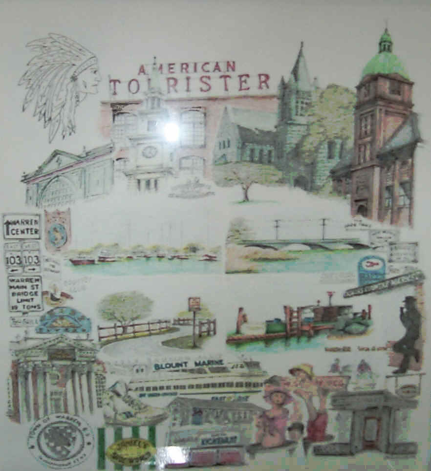
Click on the image above to see the full size version.
The Location:
http://www.townofwarren.org
My Feelings:
What you're looking at is not a picture from Warren, Rhode Island's website. No no no. What you're looking at is the background! The background at 50% its normal size! Most webmasters feel that if you were going to have a full color photograph at 100% opacity as your background that you would at least have it be a good photo. Not the webmaster of http://www.townofwarren.org! He or she breaks free from such conventions by putting a blurry photo complete with lens flare as the background of this site, paving the way for future webmasters who may want to include such photographs (presumably of a picture drawn on a dry-erase board) as the background for their sites.
The Crappy Thing:
The Location:
http://www.northsmithfieldri.com/links.htm
My Feelings:
I wasn't quite sure what to make of this one. I just can't imagine why someone would want to put such a crappy, slow running, uninspiring javascript marquee on this official government site. If they were going to waste their time programming such a thing you would think it would at least be something interesting like that quote about how "First they came for the Jews..."
The Crappy Thing:

The Location:
http://www.centralfallsri.us/
My Feelings:
That's right, folks. A webcounter. When I first set my eyes on this li'l beauty my first impluse was to run to my town's central square and fish a copy of today's newspaper out of the trash where I would no doubtedly see the date: November 5, 1996. The saddest part of all of this is that they poor little, teensy-weensy town of Central Falls, Rhode Island has had less than one thousand people view their website! They've only managed to get their site's hits to equal 1/22 of their actual population (18,927 according to the 2000 census). Sure if you wanted to point the finger you could blame them for having such a visually unappealing and content-free site but who would benefit from such criticism? Instead I suggest that we help them! Lanceandeskimo.com gets more than 846 hits in any given hour. Let's help them out a little. Just visit http://www.centralfallsri.us/ and let's bring that number up over 1,000! We can do it!
The Crappy Thing:

The Location:
http://www.ci.woonsocket.ri.us/
My Feelings:
I see this and I understand what they were trying to do. I salute them for a valiant effort. It is clear that they were trying to make a seal of the city of Wooncosket that rotated, but they just did it all wrong. Instead what we have is a rather ghastly, pulsating and undulating seal. It looks as if some horrible experiment trying to cross the seal of the Woonsocket with the heart of a pig has gone horribly wrong. Maybe it shouldn't but it really grosses me out.
more coming soon ...
|