 Sign In
 Register
 Help
Help

This doesn't quite fit in any other thread, so I'll just put it here.
Having recently played Adventures in the Galaxy of Fantabulous Wonderment, I decided I wanted a decent picture of Dan Gordon (and possibly Co.) for my desktop. Unfortunately, I soon discovered that Dan Gordon isn't as easily posable as other characters.
So I made this instead: http://img301.images...=aitgofwkc2.jpg
It's pretty awful. If anyone has any ideas for something along the lines of what I originally wanted, it'd be much appreciated.
Also, if anyone knows how to make the thing above better, I'll try and oblige until I get bored and decide I can't be bothered.
Arts and Crafts
 MultiQuote
#2
 Zewb
Zewb 

- Level Boss
-

- Group: Former Members
- Posts: 299
- Joined: 04-August 05
- Location:Texas
- Interests:Things and stuff.
- Country:United States
Posted 13 August 2006 - 10:25 PM
Better than anything I could do.
"It's gettin' to be re-goddamn-diculous. If you guys don't start thinking as men, we're gonna have a lousy country."
-John Wayne
-John Wayne
#3
Yahtzee

- Level Boss
-
- Group: Moderators
- Posts: 402
- Joined: 03-March 04
- Country:Nothing Selected
Posted 13 August 2006 - 11:10 PM
Indeed, another excellent piece of work. You might want to revise Bromide a bit, she's looking a bit rough. Here's a reference image:
This picture was a collaborative effort between my girlfriend and I. I pencilled it, she inked it in Photoshop. I think there's a coloured one somewhere but I forget where.
This picture was a collaborative effort between my girlfriend and I. I pencilled it, she inked it in Photoshop. I think there's a coloured one somewhere but I forget where.
As I walked through the valley of the shadow of death, I realised that it could do with a lick of paint.
#6
setasouji
- Mini Boss
-
- Group: Junior Members
- Posts: 111
- Joined: 03-August 06
- Country:United States
Posted 14 August 2006 - 02:15 AM
QUOTE (David-kyo @ Aug 13 2006, 11:13 PM) <{POST_SNAPBACK}>
Very nice work yet again, I'd leave it at that if I were you. 
I can't stop messing with things. It's a curse.
http://img132.images...=aitgofwvi7.jpg
Edited because the Elaborate Gesture looked like crap before.
#7
David-kyo

- Goatboy
-
- Group: Members
- Posts: 2,305
- Joined: 18-June 06
- Gender:Male
- Interests:None of your business.
- Country:Hungary
Posted 14 August 2006 - 07:04 AM
Truth to be told, I haven't really paid much attention to the background when I said that, it does look better now. But really, please don't touch the characters, they're good as they are now.

#9
setasouji
- Mini Boss
-
- Group: Junior Members
- Posts: 111
- Joined: 03-August 06
- Country:United States
Posted 17 August 2006 - 07:27 PM
QUOTE (AdamM @ Aug 14 2006, 04:31 PM) <{POST_SNAPBACK}>
Well I'd say Hole's stance looks a bit too unnatural, and the redshirt isn't half as square-chinned and quiffed as he should be. But it's really good as it is.
Hole was meant to be leaning back as Dan bumped into him with his elbow, and I figured the redshirt's quiff wouldn't hold up in zero gravity while going light speed. But... yeah.
Anyways, I've been working on this instead:
http://img219.images...angordonbb4.jpg
I've gotten it the point where I don't like it but I cannot for the life of me figure out why, so I guess it's not going to get any better. It was more along the lines of what I wanted but it still sucks.
Harp at me about what's wrong with it and I'll try to fix it.
#10
David-kyo
- Goatboy
-
- Group: Members
- Posts: 2,305
- Joined: 18-June 06
- Gender:Male
- Interests:None of your business.
- Country:Hungary
Posted 18 August 2006 - 06:55 AM
Hmmm, not bad. However, in my opinion, Dan's face could look a bit less feminine, and Bromide didn't have such big breasts. I remember I wasn't sure of her gender first time I played the game, only when I read the database entry about her.
#11
Yahtzee
- Level Boss
-
- Group: Moderators
- Posts: 402
- Joined: 03-March 04
- Country:Nothing Selected
Posted 18 August 2006 - 06:51 PM
He seems very neat. I always imagined him as scatty, and always drew him with pretty messy hair and rumpled clothes.
FUN FACT: Dan Gordon's name is taken from the mundane halves of Dan Dare and Flash Gordon. In some early ideas for GFW he had a rival (possibly even a brother) named Flash Dare, but I dropped that idea.
ANOTHER FUN FACT: If I ever do a sequel to GFW, which seems unlikely right now, I intend to name it 'Escape from the Dimension of Insidulous Cruellitude'.
As I walked through the valley of the shadow of death, I realised that it could do with a lick of paint.
#12
setasouji
- Mini Boss
-
- Group: Junior Members
- Posts: 111
- Joined: 03-August 06
- Country:United States
Posted 19 August 2006 - 02:54 AM
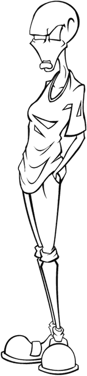
http://img241.images...angordonir6.jpg
I touched up Bromide and tried to make Dan a tad more rumpled. His shirt might need a few more wrinkles but I'm not sure.
As for his face, well... hrm, I'm not sure what to do about it. Shape-wise, it's pretty close to the only reference we have for the guy (his little talkie picture thingy). I'm having trouble with this picture since all evidence points to Dan Gordon being a giant dweeb, albeit a brave one. Making him look too manly or heroic pretty much strips his identity right out of the picture. Maybe I should have drawn him being chased by aliens or something.
#14
setasouji
- Mini Boss
-
- Group: Junior Members
- Posts: 111
- Joined: 03-August 06
- Country:United States
Posted 19 August 2006 - 08:08 PM
http://img241.images...angordondj9.jpg
I never could quite get him to look right with eyes or eyebrows, so I edited them out in a fit of passion. But just for you, I put some eyes back in. (Although you'll note he still has no eyebrows. They're behind his glasses. Honest.)
I honestly am not sure if it's better.
I never could quite get him to look right with eyes or eyebrows, so I edited them out in a fit of passion. But just for you, I put some eyes back in. (Although you'll note he still has no eyebrows. They're behind his glasses. Honest.)
I honestly am not sure if it's better.
#15
setasouji
- Mini Boss
-
- Group: Junior Members
- Posts: 111
- Joined: 03-August 06
- Country:United States
Posted 19 August 2006 - 09:13 PM
http://img241.images...angordondj9.jpg
I never could quite get him to look right with eyes or eyebrows, so I edited them out in a fit of passion. But just for you, I put some eyes back in. (Although you'll note he still has no eyebrows. They're behind his glasses. Honest.)
I honestly am not sure if it's better.
I never could quite get him to look right with eyes or eyebrows, so I edited them out in a fit of passion. But just for you, I put some eyes back in. (Although you'll note he still has no eyebrows. They're behind his glasses. Honest.)
I honestly am not sure if it's better.