Chefelf.com Night Life: Experimental technique - Chefelf.com Night Life

Jump to content

  • (13 Pages)
  • +
  • « First
  • 7
  • 8
  • 9
  • 10
  • 11
  • Last »

Experimental technique meet Dawn

#121 User is offline   Spoon Poetic Icon

  • Pimpin'
  • PipPipPipPipPipPip
  • Group: Moderators
  • Posts: 2,876
  • Joined: 27-September 05
  • Gender:Female
  • Country:United States

Posted 27 November 2006 - 11:48 AM

Hmm... For some reason, I was remembering a lot of orange in the hair I've seen from you. Maybe the colour just gets off from your computer to mine.

Hope you don't feel badly about the criticism, Gobbler - it's pretty minor; it's a beautiful piece without changing anything. Be proud! smile.gif
I am writing about Jm in my signature because apparently it's an effective method of ignoring him.
0

#122 User is offline   assignedrisk Icon

  • New Cop
  • Group: Junior Members
  • Posts: 7
  • Joined: 21-November 06
  • Gender:Female
  • Location:California
  • Interests:Demented genius things
  • Country:United States

Posted 01 December 2006 - 08:11 AM

That's a nice thought. And yeah, she was meant to indicate some kind of nobility.


I really got that. Comes through well. Very regal.
Ever....Assigned


Don't think of death as an ending. Think of it as a really effective way of cutting down your expenses. Woody Allen
0

#123 User is offline   SimeSublime Icon

  • Monkey Proof
  • PipPipPipPipPipPipPipPipPipPip
  • Group: Moderators
  • Posts: 6,619
  • Joined: 06-May 04
  • Gender:Male
  • Location:Perth, Western Australia
  • Country:Australia

Posted 04 December 2006 - 11:19 AM

I love it. You've gone with some bold new directions here. The skin definately helps bring her to life. I was going to say I was particularly impressed with the collarbone, but you went and ruined that by mentioning it yourself tongue.gif
The Green Knight, SimeSublime the Puffinesque, liker of chips and hunter of gnomes.
JM's official press secretary, scientific advisor, diplomat and apparent antagonist?
0

#124 User is offline   Gobbler Icon

  • God damn it, Nappa.
  • PipPipPipPipPipPipPipPip
  • Group: Members
  • Posts: 4,560
  • Joined: 26-December 05
  • Gender:Not Telling
  • Location:Three octaves down to your left.
  • Interests:Thermonuclear warfare and other pleasantries.
  • Country:Nothing Selected

Posted 01 February 2007 - 05:57 PM

Myeh. Sorry for being half asleep while typing, but the mood fits. I'll explain somewhere down there. Maybe. Yeah. Right on. Whatever.

QUOTE (Spoon Poetic @ Nov 27 2006, 05:48 PM) <{POST_SNAPBACK}>
Hope you don't feel badly about the criticism, Gobbler - it's pretty minor; it's a beautiful piece without changing anything. Be proud! smile.gif

Am. No worries. Couldn't bring myself to work on Lisian, though. Had other things in mind, can't seem to get into the mood for her anymore.

QUOTE (SimeSublime @ Dec 4 2006, 05:19 PM) <{POST_SNAPBACK}>
I love it. You've gone with some bold new directions here. The skin definately helps bring her to life. I was going to say I was particularly impressed with the collarbone, but you went and ruined that by mentioning it yourself tongue.gif

Sorry. Should fight that urge to praise myself sometime.

*yawn* Alrighty then, let's getta started...

Created something new.
Started with me thinking: "Forget your dreams and put what you've learned so far to use".

Did the opposite. Sorree.

It ain't much, and I've been mostly asleep while drawing it. Don't have too many memories about that part, mind just went blank for a couple of hours each day. Spares me the trouble of elaborating, I guess.

Oh yeah, one piece of advice, if you should ever think about drawing human skin or anything else:

Colours reflect colours.


There. Thaz all ya needs to know.


Am thinking about making it a print on deviantART. Needed something to stick onto my new flat's wall anyways. Sorry for making it so obnoxiously big, with an aspect ratio of 1:2. Just think away the black part on the left and it'll be 1:1,25 or whatever ya want it to be. Yawn.

Randomly made some screenshots of the progress, thought you might like to see them. I always love to see those thingies. Hope you do too. Pasted them into a little animation.

Which is actually not really "little". 600kb or so, don't say I didn't warn ya.


There ya go. Don't really feel like I'm finished yet, but meh.

Questions? Ask. Feelings? Tell. Myeh.

Going to bed now. 'Night.

Quote

Pop quiz, hotshot. Garry Kasparov is coming to kill you, and the only way to change his mind is for you to beat him at chess. What do you do, what do you do?
0

#125 User is offline   Spoon Poetic Icon

  • Pimpin'
  • PipPipPipPipPipPip
  • Group: Moderators
  • Posts: 2,876
  • Joined: 27-September 05
  • Gender:Female
  • Country:United States

Posted 01 February 2007 - 06:07 PM

I'm not a fan of the bright white lines, but otherwise, it's great.
I am writing about Jm in my signature because apparently it's an effective method of ignoring him.
0

#126 User is offline   Deepsycher Icon

  • Giantness of Heart
  • PipPipPipPipPipPipPipPipPipPip
  • Group: Former Members
  • Posts: 6,220
  • Joined: 22-December 05
  • Country:Nothing Selected

Posted 01 February 2007 - 06:38 PM

I have seen the skin and it looks wrinkly.
Will sharpening the surface with dots help?
0

#127 User is offline   Slade Icon

  • Full of Bombs and/or Keys
  • PipPipPipPipPipPipPipPipPipPipPipPip
  • Group: Head Moderator
  • Posts: 8,626
  • Joined: 30-November 03
  • Gender:Male
  • Location:Columbia, SC
  • Interests:I like stuff.
  • Country:United States

Posted 02 February 2007 - 02:32 PM

'Tis a nice butt, and I agree that in this case the lines detract from it. The rest of the composition isn't abstract enough for those to juxtapose properly. Otherwise, woot. A nice rendering of a nice form. tongue.gif
This space for rent. Inquire within.
0

#128 User is offline   David-kyo Icon

  • Goatboy
  • PipPipPipPipPipPip
  • Group: Members
  • Posts: 2,305
  • Joined: 18-June 06
  • Gender:Male
  • Interests:None of your business.
  • Country:Hungary

Posted 03 February 2007 - 04:20 AM

Wouldn't it be a bit better if you cropped down the coloured outlines to the white lines? Because to me it looks a little bit funny with blurred colours combined with those strict lines... Otherwise, it's very nice.
0

#129 User is offline   Gobbler Icon

  • God damn it, Nappa.
  • PipPipPipPipPipPipPipPip
  • Group: Members
  • Posts: 4,560
  • Joined: 26-December 05
  • Gender:Not Telling
  • Location:Three octaves down to your left.
  • Interests:Thermonuclear warfare and other pleasantries.
  • Country:Nothing Selected

Posted 03 February 2007 - 08:16 AM

QUOTE (Spoon Poetic @ Feb 2 2007, 12:07 AM) <{POST_SNAPBACK}>
I'm not a fan of the bright white lines, but otherwise, it's great.

Hmm...

QUOTE (Deepsycher @ Feb 2 2007, 12:38 AM) <{POST_SNAPBACK}>
I have seen the skin and it looks wrinkly.
Will sharpening the surface with dots help?

Dots wouldn't sharpen the picture in this case, but rather make it look like she had cellulitis. I blurred the picture with a dozen of different settings and this version was the best choice, believe me. I won't go any further than this.

QUOTE (Slade @ Feb 2 2007, 08:32 PM) <{POST_SNAPBACK}>
'Tis a nice butt, and I agree that in this case the lines detract from it. The rest of the composition isn't abstract enough for those to juxtapose properly. Otherwise, woot. A nice rendering of a nice form. tongue.gif

Hmm...

I see what you guys mean, really, I do. It's just a bit difficult for me to discard those lines just like that... hmm... I'll have to think about this some more.

QUOTE (David-kyo @ Feb 3 2007, 10:20 AM) <{POST_SNAPBACK}>
Wouldn't it be a bit better if you cropped down the coloured outlines to the white lines?

Makes sense, I guess.

QUOTE (David-kyo @ Feb 3 2007, 10:20 AM) <{POST_SNAPBACK}>
Because to me it looks a little bit funny with blurred colours combined with those strict lines...

Agreed. Well, I actually just left that edge like it was, most of it was already painted that way, the blur didn't add much to the effect there. Let's see, let's see... crop the edge, crop the edge... *corrects picture*... there, let's see whether this is better.

I've changed the ratio to 1.50:1 and went with RGB instead of CMYK colours, since they look so much nicer.


Maybe the white lines aren't that distracting now, too, but you be the judge of that.

This post has been edited by Gobbler: 03 February 2007 - 08:20 AM

Quote

Pop quiz, hotshot. Garry Kasparov is coming to kill you, and the only way to change his mind is for you to beat him at chess. What do you do, what do you do?
0

#130 User is offline   Spoon Poetic Icon

  • Pimpin'
  • PipPipPipPipPipPip
  • Group: Moderators
  • Posts: 2,876
  • Joined: 27-September 05
  • Gender:Female
  • Country:United States

Posted 03 February 2007 - 11:07 AM

Sorry Gobbler, the white lines still don't do it for me. Like Slade said, the rest of the composition isn't abstract enough to justify the white lines. To me, it just looks like someone took a lovely painting and drew all over it. I'm not trying to be insulting, please don't take it the wrong way. But the realism and the abstraction just aren't meshing here. Other than that, it's gorgeous.
I am writing about Jm in my signature because apparently it's an effective method of ignoring him.
0

#131 User is offline   Gobbler Icon

  • God damn it, Nappa.
  • PipPipPipPipPipPipPipPip
  • Group: Members
  • Posts: 4,560
  • Joined: 26-December 05
  • Gender:Not Telling
  • Location:Three octaves down to your left.
  • Interests:Thermonuclear warfare and other pleasantries.
  • Country:Nothing Selected

Posted 03 February 2007 - 01:11 PM

That's pretty much putting me into a pinch now, as I can't seem to think of a good way to get rid of 'em without messing up the picture. It really doesn't look good withou- ah, darn it, I might as well show you... here.

The hard colours that determine the edges are missing and I really don't wanna draw them, since it somehow makes me feel weird, like I'd be betraying myself. Well, that's what happens when you draw the lineart first and work with that, instead of doing it all independently...

... here's the simple lineart, just for the fun of it.

Quote

Pop quiz, hotshot. Garry Kasparov is coming to kill you, and the only way to change his mind is for you to beat him at chess. What do you do, what do you do?
0

#132 User is offline   Spoon Poetic Icon

  • Pimpin'
  • PipPipPipPipPipPip
  • Group: Moderators
  • Posts: 2,876
  • Joined: 27-September 05
  • Gender:Female
  • Country:United States

Posted 03 February 2007 - 04:37 PM

I'm really sorry, but I actually like that better. I see what you mean about lacking the hard edges, though - this looks like an out of focus photograph or something. It just needs a little definition, that's all. Maybe you could find some way to sharpen it up? But at the same time, the soft diffusion of the details can be kinda nice. Also, that wedgy looks terribly uncomfortable. tongue.gif
I am writing about Jm in my signature because apparently it's an effective method of ignoring him.
0

#133 User is offline   Gobbler Icon

  • God damn it, Nappa.
  • PipPipPipPipPipPipPipPip
  • Group: Members
  • Posts: 4,560
  • Joined: 26-December 05
  • Gender:Not Telling
  • Location:Three octaves down to your left.
  • Interests:Thermonuclear warfare and other pleasantries.
  • Country:Nothing Selected

Posted 03 February 2007 - 07:36 PM

I see your point, but even though several people already came up to me saying I had no such thing as a style, I still can't erase those lines 'cause it would just not be the aforementioned anymore.

I've been thinking about it for hours now, and I'm almost certain that there is a way to make it work without them. But I won't do that.

I feel bad just thinking about it. Those lines are a vital part of my style, and especially of this picture. They're weren't just mere guides to help me draw the skin, they were - and still are - essential. They're exact. They're elegant. And I'd like to think that this is my style. I'm not just randomly throwing paint at the canvas, I'm trying to be as exact as I can and calculate a lot, since that's what I'm inherently really good at. Must be a Kraut thing, I guess.

As I said, thinking about it makes me feel bad. Uneasy, even. I ain't no robot, I only use logic and calculation to achieve my goals, but I choose these goals by listening very closely to my inner voice.
My, err... style somehow dictates that I can't have that picture without those lines, as it would lack the precision that I intend to realize. And my inner voice agrees. I think... no, I know that I should trust it.

But enough of all that drama. I've received a lot of input from many people now and I honestly do really appreciate it, it's been helping me a lot and enabled me to better the picture to a certain extent, but I won't go any further than that. I never feel threatened or angered by intelligent criticism, in fact, I really enjoy it, so let's not make a fuss about it. biggrin.gif I can tell you that I've learned a bit from it and I've already got one or two ideas on how to make everyone happy with the next project in my mind, but only time will tell if it'll work out that way.

... my, my, who would have thought that something I drew whilst being half asleep could have me think so much...

This post has been edited by Gobbler: 03 February 2007 - 07:37 PM

Quote

Pop quiz, hotshot. Garry Kasparov is coming to kill you, and the only way to change his mind is for you to beat him at chess. What do you do, what do you do?
0

#134 User is offline   SimeSublime Icon

  • Monkey Proof
  • PipPipPipPipPipPipPipPipPipPip
  • Group: Moderators
  • Posts: 6,619
  • Joined: 06-May 04
  • Gender:Male
  • Location:Perth, Western Australia
  • Country:Australia

Posted 11 February 2007 - 09:15 AM

Ignore them, I liked the orrigional the most.

I think it livens up the picture, giving it the hint that more is happening. It's hard to explain, I see the picture in the background and the lines above it as seperate entities, with the lines themselves in a sort of flux. This lends a feeling of life to the rest of the peice.

And I also liked the orrigional aspect, it gave me the impression that text was to accompany the picture.
The Green Knight, SimeSublime the Puffinesque, liker of chips and hunter of gnomes.
JM's official press secretary, scientific advisor, diplomat and apparent antagonist?
0

#135 User is offline   Gobbler Icon

  • God damn it, Nappa.
  • PipPipPipPipPipPipPipPip
  • Group: Members
  • Posts: 4,560
  • Joined: 26-December 05
  • Gender:Not Telling
  • Location:Three octaves down to your left.
  • Interests:Thermonuclear warfare and other pleasantries.
  • Country:Nothing Selected

Posted 11 February 2007 - 09:35 AM

It was... but probably not what you imagined. smile.gif 
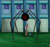
Rather something along the lines of "Battle Panties FTW!", so you should be happy that I left it out wacko.gif That, and I also tried to create some backgrounds, but nothing really looked good in comparison to the all black canvas.

But oh well, if you can come up with some neat text that fits the mood or whatever - fire away, I say!

And yeah, that 2:1 ratio was my favorite too, but as I said, I wanted to release it as a print on deviantART, and the highest size for 2:1 would be 8"x4" there, while 1.50:1 already allows 36"x24", which is indeed quite a difference, so I changed it to that. Oh well, but I still do happen to work for the biggest printer company there is, so if you want to buy an insanely hugh print with 2:1... tongue.gif

QUOTE (Mr. Sublime)
I think it livens up the picture, giving it the hint that more is happening.

Hmm... I'm still wondering about which version I prefer... you do seem to have a point... hmm... it's correctness versus more life then... I'll give it another thought.

Quote

Pop quiz, hotshot. Garry Kasparov is coming to kill you, and the only way to change his mind is for you to beat him at chess. What do you do, what do you do?
0

  • (13 Pages)
  • +
  • « First
  • 7
  • 8
  • 9
  • 10
  • 11
  • Last »


Fast Reply

  • Decrease editor size
  • Increase editor size